

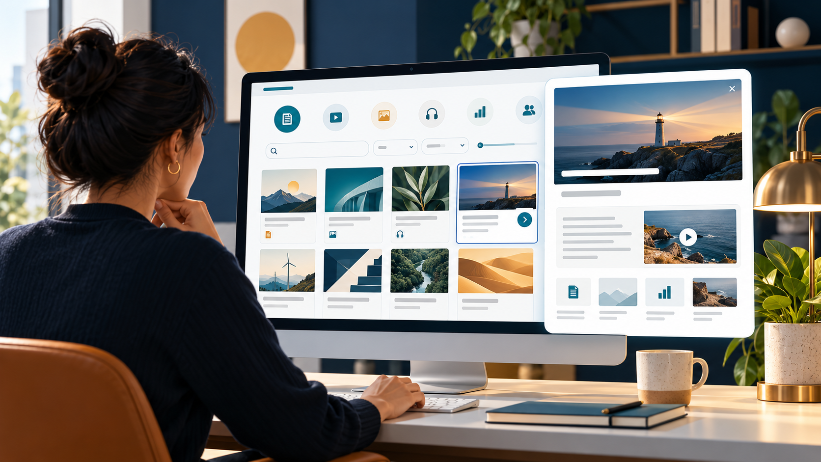
A B2B resource center is more than a grid of ebooks and webinars. It is a discovery system that helps a visitor move from a question to the most useful next item, then decide whether to read, watch, compare, or speak with your team. The design should make each resource understandable before asking the visitor to click or submit information.
This page type differs from an article archive: it brings together several formats and buyer tasks, often across a large catalog. Its structure has to help people recognize what is relevant, not just show what the marketing team has published.

Begin with buyer questions, not file formats
Inventory the resources you have and record the question each one answers, the audience it serves, how current it is, and what the visitor should be able to do afterward. Use analytics, search terms, support questions, and sales conversations to identify repeated needs. GOV.UK’s content-design guidance starts with user needs and recommends choosing the amount, format, and place of content based on those needs.
Do not make “white papers,” “webinars,” and “case studies” the only top-level categories. Those labels describe the format, but not always the problem a visitor is trying to solve. A resource can be discoverable by topic or task and still show its format as a useful filter or label.
Build categories around questions people recognize
Choose a small set of topics or tasks that reflect real differences in visitor intent. For example, a buyer might be researching measurement, comparing implementation approaches, or preparing an internal business case. Avoid categories that only make sense to the team that created them. NN/g’s concept of information scent explains why: link labels and nearby context help people estimate whether a destination is worth opening. Vague labels such as “Insights” or internal product jargon give fewer useful cues than a specific topic or outcome.
Keep the model flexible enough for a resource to belong in more than one useful place, but do not add labels just to create a large filter menu. The navigation-testing guide covers how to test whether visitors understand your categories.
Make every resource card answer “Is this for me?”
A listing card should provide enough information to choose without opening every item. Include a descriptive title, the question or outcome it addresses, intended audience when relevant, format, and freshness when that matters. If a resource is gated, make that clear before the click. A thumbnail alone cannot explain the value of a guide or report.
- Write titles that describe the subject rather than relying on a campaign slogan.
- Use a short description to say what the visitor will learn or be able to do.
- Label the format consistently, such as checklist, webinar, case study, or guide.
- Show publication or update dates when currency affects trust.
- Use a clear action, such as “Read the guide” or “Watch the webinar,” not the same vague button everywhere.
Use search and filters to reduce work
Filters help when the catalog is large enough for visitors to need them. Common facets might include topic, role, format, or stage, but include a facet only if it narrows the choices meaningfully. Use ordinary labels, show active filters, and provide a visible reset. On mobile, make filters easy to open and close and keep the current result count or selected state understandable.
Support no-result recovery. If a search returns nothing, offer related topics, clear filters, or popular resources rather than an empty page. The existing article on B2B website search analytics explains how zero-result queries can reveal missing content or unclear naming.
Treat the resource detail page as part of the hub
When someone opens a resource, repeat its purpose, audience, format, and key takeaways. Let visitors preview enough of the material to decide whether it is relevant. A gate should appear in the context of the resource’s value, not before the page explains what the visitor will receive. For a deeper discussion of which assets to gate, see the guide to gating B2B resources.
Connect each item to one logical next step: a related guide, a product detail page, a technical resource, or a conversation. Do not place the same “Book a demo” action beside every asset if some visitors are still learning. The next step should extend the information path instead of interrupting it.
Keep the library useful after launch
Assign an owner to each resource and review date. Retire obsolete material, merge duplicates, and update titles or summaries when the content changes. GOV.UK guidance emphasizes that content should meet a user need and remain current; an archive of outdated assets can reduce trust even when its page design is polished. A content inventory or audit can help identify what needs updating or removal.
Measure whether the hub helps people find and use relevant material: internal searches, filter use, zero-result rate, resource engagement, return visits, and progression to a useful next step. Separate raw downloads from qualified outcomes. A download count alone does not show whether the visitor found the right item or whether the item helped.
A quick resource-center QA checklist
- Does every category correspond to a buyer question or task?
- Can a visitor tell what each resource contains before clicking?
- Are titles and labels clear without internal jargon?
- Do filters help narrow a real catalog and work on mobile?
- Can visitors recover when search or filters return no results?
- Are gates disclosed and are related next steps relevant?
- Is there an owner and review date for every asset?
Further reading
- Nielsen Norman Group: Information Scent — how labels and context shape expectations about a destination.
- GOV.UK: Understand content design — begin with user needs and choose the right format and place for content.
- Home Office User-Centred Design Manual: Navigation — support multiple ways to find content and keep navigation consistent.
When the resource center is organized around useful questions, uses clear signals, and keeps its catalog current, it becomes a practical part of the buyer journey—not another shelf of assets to scroll past.
How did this article land?
Choose one reaction. You can change it anytime.