

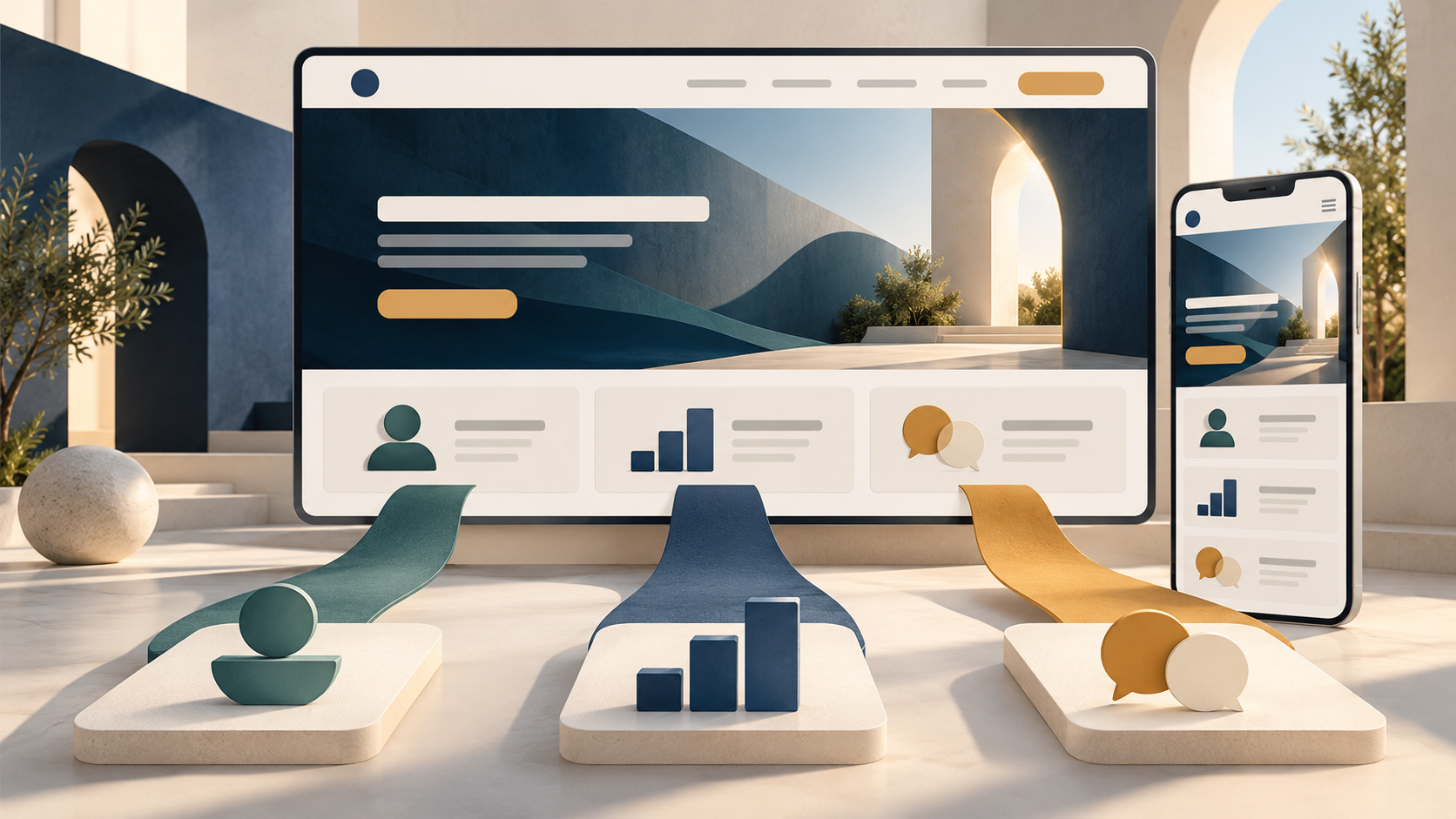
A strong B2B homepage design does not try to explain every product, audience, and feature at once. It helps a new visitor answer three questions: what does this company do, is it relevant to my situation, and where can I go next? The page works when those answers are clear enough for different buyers to choose a useful path without making the homepage a crowded sitemap.
Treat the homepage as an orientation and routing page. Product detail, technical requirements, pricing, and case studies belong on focused pages that visitors can reach when they need them. This guide turns that principle into a practical structure you can test.

What a B2B homepage is responsible for
B2B sites often serve several roles: an evaluator comparing providers, an operator checking workflow fit, an executive assessing business value, or an existing customer looking for support. These are not necessarily separate personas that need separate homepages. They are different tasks a visitor may bring to the same page.
Start with evidence. Review entry pages and search queries in analytics, questions logged by sales and support, and recent customer research. GOV.UK’s guidance on user needs recommends grounding needs in research rather than assumptions. Use those needs to decide which paths deserve a clear signpost.
1. Orient: explain the offer in buyer language
The first screen should identify the category or problem, the kind of organization that benefits, and the outcome the offer supports. Prefer a concrete statement such as “Plan and approve field work in one workspace” over a broad claim like “Unlock your potential.” A visitor should not need to decode an internal product name before understanding the page.
Add a short explanation of how the offer works or what makes it relevant. Keep the main statement specific enough to distinguish you, but avoid unsupported superlatives. If a claim depends on a particular customer, workflow, or result, place the proof nearby.
2. Prove: answer the next reasonable doubt
A promise creates questions: does this work for an organization like mine, can it fit our process, and is the vendor credible? Place evidence beside the relevant claim: a named customer story, a documented outcome, a security resource, an integration list, or a product view. Proof should reduce a specific doubt, not simply decorate the page with logos.
Choose evidence you can substantiate and maintain. A case study with a clear context and method is more useful than a row of unexplained badges. If an important evaluator needs technical or compliance detail, link to a dedicated page rather than squeezing the explanation into the hero.
3. Route: make the next step match visitor readiness
Give the page one visually primary action that reflects the main commercial goal, then offer a small number of meaningful alternatives for visitors who are not ready for that commitment. For example, a demo request may sit beside “Explore use cases” or “See how the workflow works.” A resource should lead to a relevant resource, not to a generic contact form.
- Keep calls to action descriptive: tell people what happens after they click.
- Map each route to a focused destination page with a consistent promise.
- Use audience or use-case links only when research shows visitors recognize those distinctions.
- Do not style every link as an equally urgent button; hierarchy is part of the decision support.
For a larger navigation model, use card sorting and tree testing to check whether people can predict where a destination lives. The homepage can introduce the routes; navigation and supporting pages carry the deeper structure.
4. Learn: measure whether the route creates progress
A homepage click-through rate is only an early signal. Pair it with the outcome of the next step: qualified demo submissions, progression from a use-case page to a relevant conversion, or successful completion of a high-value self-service task. Segment results by source and device so a strong route for referral traffic does not hide confusion among organic visitors.
Agree on a small event map before launch: homepage view, primary action, key route selection, destination engagement, and the downstream conversion that matters. The website conversion measurement guide explains how to define conversion rates without treating every click as equal.
A flexible homepage structure to test
A useful starting sequence is: clear offer and action; relevant proof; a short explanation of how the product or service works; paths for the main use cases; a deeper customer example; and a closing next step. This is a hypothesis, not a template to apply blindly. NN/g’s homepage guidance emphasizes purpose, useful content, action and navigation, and simplicity. The order should follow the questions your own visitors ask.
Review the layout on mobile, keyboard, and assistive technology as well as on a desktop mockup. Keep link labels understandable out of context, provide meaningful alternatives for images, and make focus visible. A technically polished hero is not successful if its action is hard to find or use.
Test comprehension before a full redesign
Before committing to a large build, show a prototype or current page to people who resemble your buyers. Ask them to explain what the company offers, which route fits their task, and what they expect to happen after selecting it. Observe where they hesitate. Then compare those observations with traffic and conversion data. This catches confusing labels and missing proof earlier than a broad visual refresh.
For search traffic, connect homepage pathways to focused pages that match distinct buyer queries. The guide to B2B service-site architecture and search intent shows how those destinations can work as a coherent system.
Further reading
- Nielsen Norman Group: Homepage Design — 5 Fundamental Principles.
- GOV.UK Service Manual: Learning about users and their needs.
The best B2B homepage is not the one with the most sections. It is the one that makes the offer understandable, puts credible proof near important claims, and gives each visitor a useful next step. Start with real buyer questions, then keep only the content that helps answer them.
How did this article land?
Choose one reaction. You can change it anytime.